I’ve been writing software “for a living” for more than ten years. I’m
afraid I have to admit that, for more than ten years, I’ve been using
z-index without really understanding it.
z-index is a CSS property that is used to position elements above or
below one another. It’s your weapon of choice if you have two overlapping
elements and you want to decide which one goes on top. It’s quite useful
for modals, tooltips, banners, etc. You can set it to an integer and a
larger value will generally result in the element being rendered on top of
the rest.
That’s pretty much all I knew about it.
Usually, this is great in software: “Learn enough to be dangerous” they
say. But invariably I would find myself fighting with z-index and
spending hours trying to understand what is wrong with Life, the Universe,
and Everything.
I’m pretty sure it’s not just me. It’s common to bump into CSS like this:
z-index: 99999
Which is pretty much the equivalent of the developer saying:
this is too wild, byeee
Well, let’s tackle this beast with some examples.
The setup
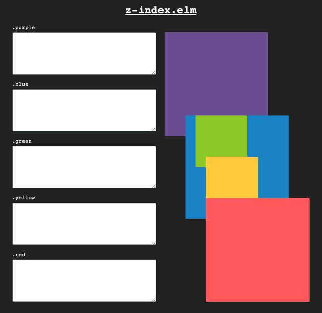
I’ve created a little app to make things easy. It looks like this:
The boxes on the right are positioned statically. This is the default when
you don’t specify a position property, therefore a statically positioned
box is also known as a non-positioned box. I’ve added some negative
margins so they overlap with one another.
On the left-hand side, you can type some styles which will be applied to the boxes. Notice that you can also share the setup by copying the URL. Let’s get started now!
Ordering matters
Here’s the HTML that powers the page:
<div class="purple"></div>
<div class="blue">
  <div class="green"></div>
  <div class="yellow"></div>
</div>
<div class="red"></div>
As you can see, ordering in the HTML matters. The red box is positioned above the rest because it appears later in the code.
z-index doesn’t work by itself
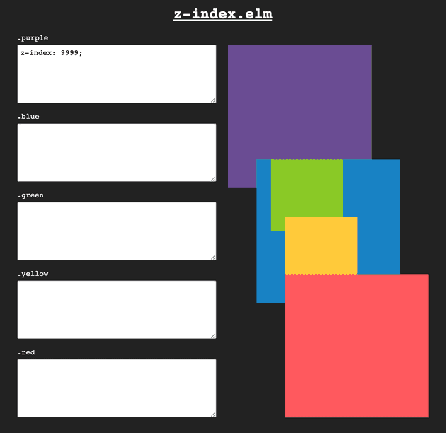
Look at this:
That’s rule number one:
z-index works only on positioned elements.
So z-index only works on elements that have a position property set to:
relativeabsolutefixedsticky
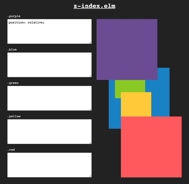
There we go:
Would you be able to guess what happens when we remove the z-index
property from this example? Go on, I’ll wait.
This is what we see:
It turns out that positioned boxes appear on top of non-positioned boxes. If you’re inclined, the spec goes into much more detail.
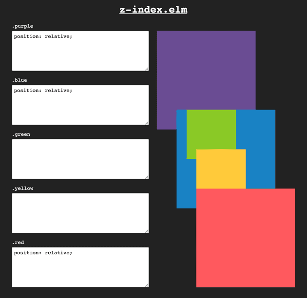
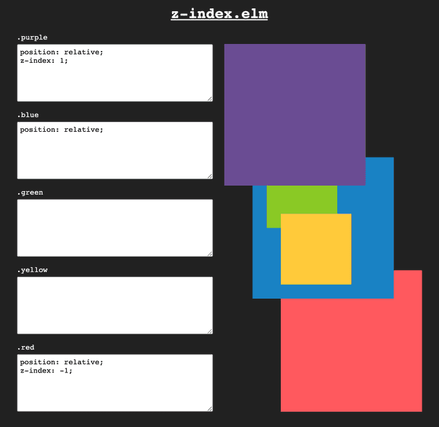
But if all the boxes are positioned, we revert to following the order in the HTML source. Look at this:
And at that point, specifying a z-index does
work!
Using the powers of z-index we were able to reverse the default stacking order of
the boxes. Go us.
A new mystery
Let’s look at this example:
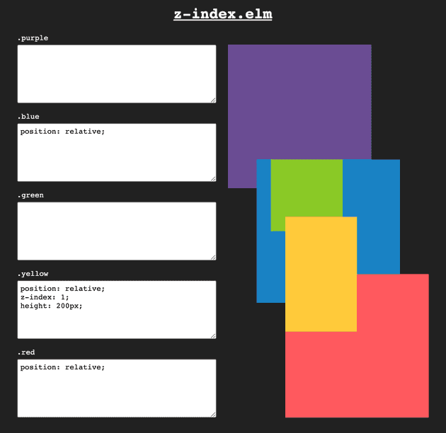
Out of the three positioned boxes, the yellow one has z-index: 1, and
therefore appears on top. Good, the world is making sense.
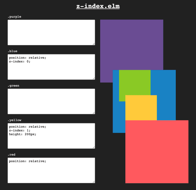
But what if we give a z-index to the blue box, the parent of the yellow box? Our
example would look like
this:
What’s happening here? Our yellow box is now rendered below the red one?!
All this because we added a z-index: 0 to the blue one?! The world is
making no sense again. 😿
Let’s take a bit of a detour…
Auto is not zero
If we don’t set the z-index property of an element, its default value is
going to be auto. Such elements will appear in front of elements with
negative z-index values and below elements with positive z-index
values.
This
should convince you that I’m not lying:
So in a way that element behaves as if we set z-index: 0. Indeed, if we
add that CSS rule, we see no notable changes in the
output:
But things changed a lot! Giving a value to z-index to a relatively
positioned box creates a new stacking context.
A stacking what? MDN says:
The stacking context is a three-dimensional conceptualization of HTML elements along an imaginary z-axis relative to the user, who is assumed to be facing the viewport or the webpage. HTML elements occupy this space in priority order based on element attributes.
I thought this is what we were trying to do all along. Let’s keep reading.
The interesting part comes later:
Within a stacking context, child elements are stacked according to the same rules previously explained. Importantly, the z-index values of its child stacking contexts only have meaning in this parent.
That’s the key point. A stacking context will force the z-index of its
child stacking contexts to only have a local meaning. Let’s look at our
mysterious example again:
Setting z-index: 0 on the blue box changed the meaning of the z-index
declaration on the yellow box. Before, the yellow box was out there playing
with the big boys. Now, it can only affect stacking within the blue box.
This is a great cause of frustration. No matter how high you set a
z-index property, you will never be able to ‘escape’ the parent
stacking context. And every time you are struggling with making z-index
work you can bet that it’s because something created a stacking context
that you can’t escape from.
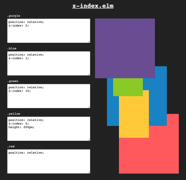
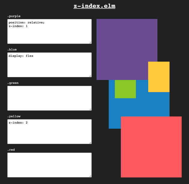
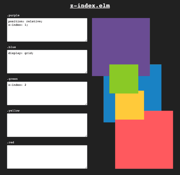
With this newfound understanding, spend some time explaining why this example makes perfect sense:
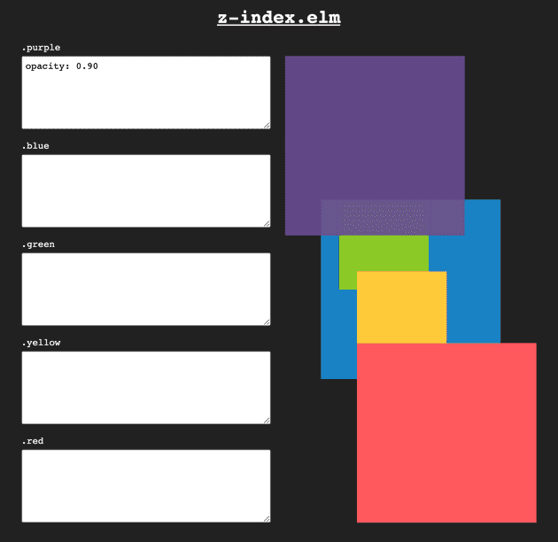
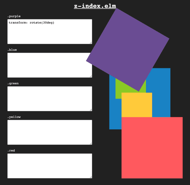
Also remember that before we said that positioned elements appear on top of non-positioned elements? Well, now we can generalize by saying that elements that form a stacking context appear on top of non-positioned elements.
The usual suspects
The MDN article lists all cases when a new stacking context is formed. I’m going to go through a list of usual suspects.
Some of these examples might look surprising. In general, the underlying
reason why these configurations create a new stacking context is that they
render to an offscreen context. But in practice, you don’t need to remember
all of them: when you bump into a situation where z-index isn’t working
as intended, you can quickly check if there’s a runaway stacking context
that’s keeping you locked up.
I recommend going through each one of the examples, playing around with them, and explaining in your head why they make perfect sense. It might be helpful to install a browser extension to help check your intuition and solidify your understanding (Chrome, Firefox).
That’s all I have for you today. As always, thanks for reading!
